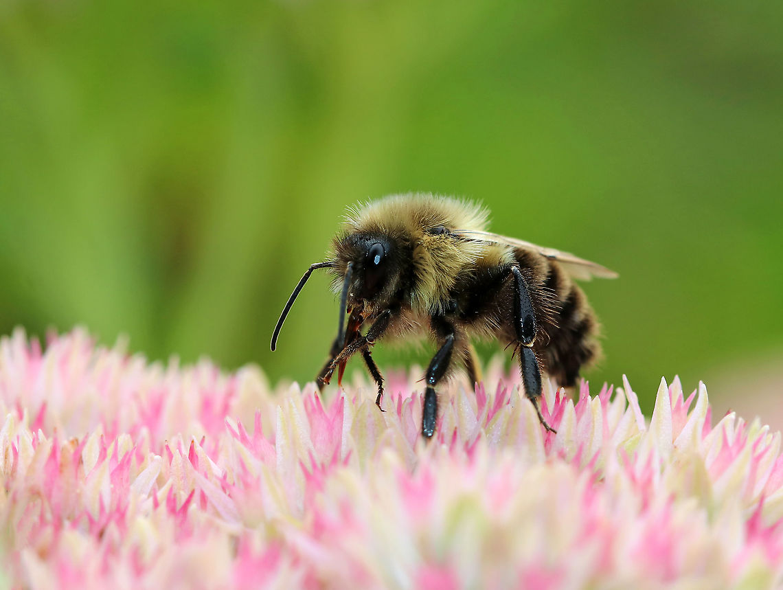
"Bombus impatiens", the common eastern bumble bee, is the most commonly encountered bumblebee across much of eastern North America. They can be found in the Eastern temperate forest region of the eastern United States, southern Canada, and the eastern Great Plains.
Similar species: Wasps, Bees, Sawflies And Ants
By Christine Young
All rights reserved
Uploaded Feb 19, 2020. Captured Sep 2, 2019 08:15 in 91 Main St, Sharon, CT 06069, USA.

comments (24)
I like the effect when the front of hairs is in focus yet as you go back, they become softer. It gives a sense of depth.
The dark spots...should be there if we try to recreate a natural situation where light comes from the top. Yet if you find it more attractive to show more detail there: RAW. Posted 5 years ago
The human visual system has a LOT more dynamic range than a camera sensor, able to see much more detail in shadows and light areas, as well being able to do so in relative low light conditions. A camera's limitation in doing the same can be overcome, in part with RAW, but if you want to go all the way: HDR via bracketing.
In terms of data, you'd be working with a dynamic range that can match the human visual system, but this isn't true for the output of this data. Displays can't output such wide dynamic range. This is why this very wide range of exposure is mapped into a smaller range that a typical display can actually output, a process called tone mapping.
It works, it does have the effect of enriching details in dark and light areas, it just doesn't extend the actual total range. So the camera can do it (via bracketing), we can process it and work with it, but we can't output it to its full extend.
The situation is different for video, as you may know, modern TVs may support HDR video. These screens actually can output a far wider range of exposures, and if the content was produced like that, you do get the genuine effect of additional dynamic range.
This all sounds like a mess, but here's a comforting thought: very often you really don't need or want this. In a typical medium exposure situation for your eyes (no extremes in exposure), things get averaged out. So you get a balanced view that shows detail across this average, yet it's rather dull. It works, but it's not necessarily attractive, contrast is pretty low. Most people would probably not like that in photos, they want a little more "punch".
Only when there's exposure extremes (sunset as an example) do cameras really show their dynamic range limitations, and you may want to use any of the techniques above. In all other "average" cases, I'm not sure if it's worth the pain. The result may be more accurate, but less attractive.
Up next color.... Posted 5 years ago
Problem one is white balance. With JPEG it is fixed, with RAW possible to change afterwards. Yet even with RAW you can't be sure what the accurate white point is in the scene. Just because you set it, doesn't mean it is set right.
During capturing, there's only one way I know of to get this right: insert a gray card in the scene. This is a 18% neutral gray. You photograph it as part of the scene, you can then remove it and take another shot without the card.
Imagine you did this on a sunny day, the gray kind of turned light yellowish on the photo. Next, in Lightroom, you click the light yellow because you know for sure this to be neutral, and that's it...Lightroom will now calculate the temperature of the scene relative to what you picked. And you picked right, because that card is neutral. Your white balance will be correct, the scene will have the temperature the way your eyes saw it, or something very close to it.
Most people won't bother with this procedure and simply try to get close to what "feels" right. This in itself is inaccurate but usually close enough.
Except for this detail....what feels right on YOUR screen. Which probably isn't calibrated. Your monitor could be too cool and you got used to it as your normal, whilst other people on their screen see your photos as very hot. Similarly, you may prefer a low brightness monitor for comfort, yet then make your photos overexposed (to other people) to compensate.
The solution here is obviously to calibrate your screen. Which in itself is error prone and has a huge dependency on the room/light you're in.
Yet even then when you did that properly, it still means other people are watching on non-calibrated screens.
So you can't entirely solve color temperature issues, but there's some things you can do to reduce the problem: think with a bit more care about white balance, invest in calibrating your screen, etc.
You can also do nothing, as we should not exaggerate the problem too much. Usually what one feels is right, is close enough. Only when you're on a terrible monitor that is completely misconfigured, may there be serious issues.
Another color part coming below... Posted 5 years ago, modified 5 years ago
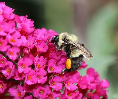
This in contrast to model photography. I was recently "forced" to do some family photography and during post processing it's easy to see how much more intolerant we are when it comes to human faces. If they look too gray or pale, people notice, same when they're red as a tomato. A blue-ish or green tone? Immediately noticed.
Nobody notices when an insect is too hot. They don't even know what it's supposed to look like. Use that to your advantage to not worry too much about it :)
Posted 5 years ago
To calibrate....
You can rely on a screen that is factory calibrated. This does not calibrate it for your specific room, yet at least it's a screen with a solid starting point. This is an awesome site:
https://www.tftcentral.co.uk/articles/icc_profiles.htm
...to learn about the screen you intend to purchase. Also after purchase, if needed, you can find recommended settings should the factory default not be accurate.
If you want more precision and tune calibration to your room/light situation, a colorimeter is a device to buy. Not super expensive, I recently purchased one.
The ultimate big budget solution is an auto-calibrating photography monitor, such as the ones Eizo has. Me want! Posted 5 years ago
https://www.eizo.nl/coloredge/cg319x/
It's 4K resolution and self-calibrating. The 5K EUR price is kind of absurd if you realize that a similar 4K IPS LCD is about 500 EUR. Same resolution, same panel tech (IPS). Just less color and less accurate color.
If you think this is crazy, out-of-reach gear, try to avoid monitors optimized for video. Check out this reference monitor:
https://www.eizo.com/products/coloredge/cg3145/
...it's only 30K EUR. Posted 5 years ago
The human visual system sees way more color than a typical monitor can display. The range of colors a monitor can display is called a gamut. Almost all content that you see on your screen is in the sRGB color space. It has far less colors compared to human vision, but sRGB is something every monitor can output, which is why it is used.
Some high-end monitors can display more than sRGB. Example gamuts they can display are AdobeRGB, P3, etc. These come closer to the human visual system.
To make use of such "extra colors" let's for the sake of fun inspect the steps required. It's called a 10-bit workflow.
First, you need a 10-bit color monitor. And not fall in the trap that 80% of 10-bit monitors aren't really 10-bit monitors, they're 8-bit with some weird interlace component that is faking it. So get a REAL one, and see your bank account suffer.
Next, you need a GPU (video card) that can handle 10-bit. This is even more fun. Even the highest-end consumer GPU, typically used for heavy games and costing 1200$, can't do it. Manufacturers could easily enable this functionality on such cards, but won't. They make 10-bit exclusive to their professional cards (graphics industry).
By now you're set back about 3-4K$. Next, you need to enable your camera to capture in 10 bit (which confusingly can be named 12-14 bit).
All good! Now we'll do the post processing. Every single piece of software that you use involving your photo (displaying, editing, exporting) needs to be "color managed". This means the software supports color profiles in 10 bit. If a single step fails in your total software process, you break the 10-bit chain, and it was all for nothing.
Do all of this right, and on your screen, you get to see fantastic color. Very close to the human vision system and unlike anything you've seen on a typical monitor.
Take a moment to enjoy that, because the next moment you realize it's all for nothing because nobody but you can see it, because the world uses sRGB. In fact, your fancy color photo will look completely screwed up on such displays. Posted 5 years ago
The above suggests a wide gamut monitor is a waste of money. That's not entirely true, in the sense that you can still enjoy enriched color video, games, etc yourself. Also, slowly but surely, the capability is normalized and will make way to many more consumers, it just takes time.
In the mobile/tablet space of devices, things are moving fast. A modern iPhone as an example, has an incredible color range compared to a regular desktop monitor. Example image:
https://webkit.org/blog-files/color-gamut/Webkit-logo-P3.png
On my desktop screen, and probably on yours too, the above will be a solid orange square. Open the same image on a recent iPhone and it actually shows a logo inside :) Posted 5 years ago
As for calling me an old guy. That's what my older brother used to say. And now I'm the oldest. Posted 5 years ago